If you’re in the Phoenix, AZ area this weekend, check out the Tempe Festival of the Arts, running March 31 to April 2. It’s a sprawling wonderful circus occupying Tempe’s Mill Avenue and the surrounding side streets: plenty of art, food, live music, and people-watching.
This festival’s Featured Artist is Hannie Goldgewicht, known for her blending of ceramics and basketry. Her pieces have a monumental simplicity, combining the textures of pine-needle basketry with the rich colors of her stoneware base forms.
I’ll expand this blog post later today, to show the festival award ribbons I designed to riff off Hannie’s signature ‘look’ and themes.
***
And it’s now later.
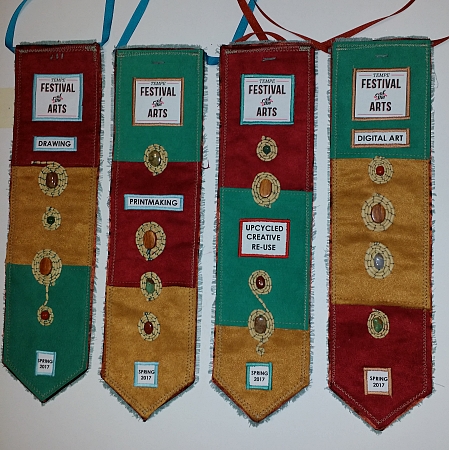
Since 2010, I’ve designed and made the fiber art ribbons used as category and grand prize winners at the Tempe Festival of the Arts. The organizers and I have hit on the strategy of having me focus on themes (such as the AZ Centennial in 2012) or riffs on that show’s Featured Artist’s show poster. When I first heard they were considering Hannie’s work for this show poster, I started getting design ideas.
First, a look back at someone who may or may not have been an inspiration to Hannie, but they were certainly firing on the same wavelength: the late fresco artist Marcia Myers.
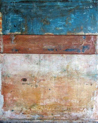
I first came across Myers’ work in a coffee table art book, and then in person at a show at Phoenix’s Bentley Projects gallery. Inspired by Venetian frescos, Myers developed her own techniques for creating lush, many layered faux frescos on canvas or board with acrylic mediums (plus other art media). Deceptively simple, these must be seen in person to be really appreciated.
They show the same light-soaked, rich colors and pleasing textures as Hannie Goldgewicht’s work.
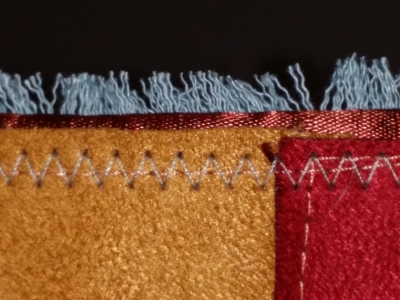
How to show those textures and tones in fabric? Ultrasuede: it has a soft nap and leather-like look that almost mimics the textures of fresco or ceramic. I had some oxblood red, aqua turquoise, and caramel-gold suede on hand from other projects.
How to keep a clean, crisp edge without a lot of bulk? Ribbon facing: a black-cherry red satin ribbon binds the edge of the cutout thick interfacing shape. Ultrasuede panels are glued and sewn on top. Bonus: I can use this edge trick on fiber book pages!
Text blocks and logo are digitally printed fabric, sewn in place with satin stitch.
Wood and stone beads (jasper, carnelian, dyed magnesite, various agates, tigereye, and aventurine) made great accents.
How to mimic Hannie’s simple pine-needle basketry? I thought about pine needles, but they are too finicky to work with in very small forms (for me, at least). Pigtail raffia, however, has long thin fibers in a rich straw to green-gold tone. When soaked to soften, then twisted, they were perfect to couch-embroider over the suede panels.
For the raffia accents, I chose very simple shapes to echo the simplicity of Hannie’s work.
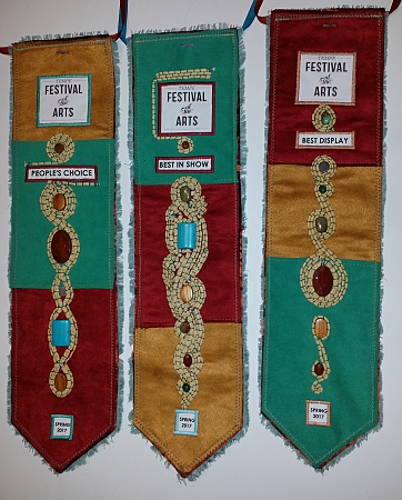
The ribbons are finished on back with seafoam-green canvas, frayed out along the edges for more texture. Ribbon ties and pinbacks offer a variety of display methods for the winners of the three major awards, the category winners, and the honorable mentions. There are 23 ribbons total in each show’s set.
I can’t wait to see what next fall’s design is going to be!