I’ll get to the story about emerald, trust me.
Well-meaning folks ask: ‘What’s your favorite color?’
I have the same dilemma, from the other direction, as a completely colorblind friend. My friend stalls, or says the question has no meaning – it’s all shades of grey according to my friend’s perception.
I’m a visual artist. Color rules my world. I respond to different colors in different ways, at different times. I don’t think I’ve ever seen a color that could not resonate with me, in an effective setting or combination. That said, there are certain colors and color sets I hold dear. They are default settings for me.
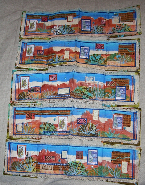 My oldest default is turquoise and rust, the colors of the American Southwest, in which my gaze was probably drenched from the moment I could focus. Sky and stone, gem and metal; it’s a comforting palette that I tend to fall back on when I’m creatively stumped. As in ‘Arizona Spring’ a set of five fabric art books for an international book art exchange a couple of years ago.
My second auto-response color set is pale green and dark blue. I can date this one to the late seventies, a Metropolitan Museum of Art catalog, and a glass paperweight from Correia Studios. 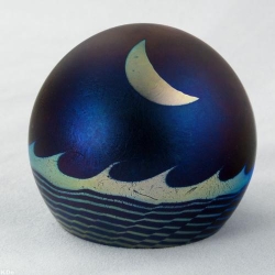 I never got to order this piece, but it left its mark in memory. Since then, this colorway has always struck me as introspective and slightly mystical: meditation colors, planetarium colors, setting the stage for a sense of awe at the universe. My 2003 book art piece ‘Night Sonnet’ makes deliberate use of those associations.
My third color set is emerald green, silver, and black. For 30 years those have been the heraldic colors of a certain character in my made-up universe. We go way back now: it’s no longer a case of Mary Sue infatuation, but a wary sense of kinship. Yes, I think, that thing came out of my psyche. ![]()
So it’s been fun to watch the Avengers fandom go nuts over the movie-Loki’s colors of green, gold, and black. I also enjoyed learning that Pantone had selected Emerald as its 2013 Color of the Year: “lively, radiant, and lush.”
Where bright emerald is a living, hopeful, almost innocent color, its darker tones evoke other things for me: the decadence of Gilded Age counterculture, dark jungles, and deep water. It’s a power color for me; it kicks me out of reserved wallflower mode. 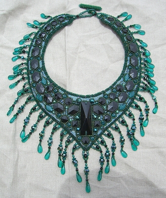 Maybe that’s why I crafted a mask and an evening gown in dark green, and why I made this ‘Black and Emerald Collar’ as a finishing touch. Will I ever wear them at a public function? Who knows? That’s not the point of making them, or celebrating the way color makes me feel.